The Integrated Palette: Crafting Serenity in the Urban Loft
This case study explores the "Serene Urban Loft," a project that masterfully integrates color, material, and light to create a tranquil urban oasis. It highlights how a holistic approach, inspired by leading design philosophies, transforms a space into a cohesive and mood-enhancing environment.

Beyond the Paint Swatch: The Integrated Palette
In the realm of interior design, the term "color palette" often conjures images of paint swatches and fabric samples. However, true mastery of a space's aesthetic and emotional impact lies in a far more holistic approach: the integrated palette. This philosophy recognizes that color is not merely a surface application but an intrinsic quality of every material, influenced profoundly by light and texture. It's about orchestrating a symphony of elements to create a cohesive, intentional, and emotionally effective environment.
Case Study: The Serene Urban Loft
Our focus today is the "Serene Urban Loft," a residential project nestled in the heart of a bustling metropolis. The design brief was clear: transform a raw, industrial shell into a tranquil sanctuary, a calm retreat from the city's relentless pace. The challenge was to achieve this serenity without resorting to a sterile, monochromatic scheme, instead aiming for a rich yet understated elegance.
The design team, inspired by the meticulous approach of firms like Studio Piet Boon, understood that success hinged on a deep dive into material and color choices from the outset. Jesseca van Haneghem, a specialist in material and product at Studio Piet Boon, emphasizes the critical role of a thoughtful color palette and the art of combining materials. This project embraced that ethos, treating every surface and object as a contributor to the overall chromatic and tactile experience.
The Foundation: Light, Texture, and Vision
The initial phase involved extensive material exploration. Rather than selecting paint colors first, the team began by identifying a core set of natural materials that evoked tranquility: bleached oak for flooring and custom millwork, a textured plaster for key wall surfaces, honed limestone for the kitchen island, and soft, matte linens for upholstery. These materials, with their inherent colors and textures, formed the foundational "color" of the space.
Crucially, samples of these materials were not merely viewed in isolation. Following the practice highlighted by Studio Piet Boon, the design team utilized large tables and light sources mimicking natural daylight to build material palettes. They would then move these samples around the loft at different times of day, observing how varying natural light conditions—from bright morning sun to softer afternoon glow—affected their appearance. This rigorous process ensured a realistic understanding of how colors and materials would behave in situ, preventing costly surprises and guaranteeing the desired mood under all circumstances.
The 60-30-10 Rule in Practice
To ensure balance and prevent the space from feeling chaotic or flat, the designers meticulously applied the 60-30-10 rule. In the main living area of the Serene Urban Loft:
- 60% Dominant Color: The expansive walls, ceiling, and large area rug adopted a soft, warm off-white derived from the textured plaster and bleached oak tones. This created a calming, expansive backdrop, allowing natural light to diffuse gently throughout the space.
- 30% Secondary Color: Mid-tone grays and muted greens, found in the linen sofa, custom built-in shelving, and select drapery, provided a gentle contrast and visual interest without overpowering the dominant neutral. These hues were carefully chosen to complement the natural wood and stone.
- 10% Accent Color: Subtle pops of deep charcoal, found in decorative pillows, a sculptural ceramic vase, and the metal frames of minimalist lighting fixtures, added depth and sophistication. These darker elements were strategically placed to draw the eye and ground the lighter palette.
This disciplined application of the 60-30-10 rule ensured that while the palette was rich in texture and subtle variation, it maintained a profound sense of harmony and calm.
Materiality as Color: Beyond Pigment
One of the most striking aspects of the Serene Urban Loft is how materials themselves act as color. The bleached oak flooring, for instance, contributes a warm, pale blonde hue that shifts with the light, offering more visual depth than a flat painted surface. The honed limestone of the kitchen island presents a cool, subtle grey with natural veining, its matte finish absorbing light differently than a glossy surface would.
Jesseca van Haneghem notes the importance of integrating different materials like wood, plaster, gloss, matte, and natural stone, emphasizing how their textures contribute to the overall palette. In the loft, the interplay of these textures—the rough plaster against smooth glass, the soft linen against hard stone—adds layers of visual and tactile interest, preventing the neutral palette from feeling monotonous. Each material's inherent color, reflectivity, and texture were considered as integral components of the overall chromatic scheme, creating a dynamic yet serene environment.
The Subtle Influence of Lighting
While not a "color" in the traditional sense, lighting was an indispensable partner in crafting the loft's integrated palette. Beyond the natural light considerations during material selection, artificial lighting was designed to enhance the chosen hues and textures. Warm, dimmable LED lighting was strategically placed to highlight the plaster's texture in the evenings, cast a soft glow on the oak millwork, and bring out the subtle variations in the limestone. This thoughtful illumination ensured that the integrated palette remained vibrant and inviting, regardless of the time of day.
A Cohesive Sanctuary
The Serene Urban Loft stands as a testament to the power of an integrated color and material palette. By moving beyond a superficial understanding of color and embracing the interplay of natural light, diverse textures, and strategic proportioning, the designers transformed a stark space into a cohesive, tranquil, and deeply personal sanctuary. It underscores that the "perfect palette" is not just about choosing beautiful colors, but about orchestrating every element to contribute to a singular, harmonious vision.
Related articles

The Integrated Gaze: Redefining the Television's Role in Modern Living Spaces
The ubiquitous television presents a persistent design challenge in contemporary living rooms. This article explores how designers are moving beyond the TV as a mere appliance, integrating it seamlessly into spaces through strategic placement, clever concealment, and multi-functional design, ensuring it complements rather than dominates the room's aesthetic and function.
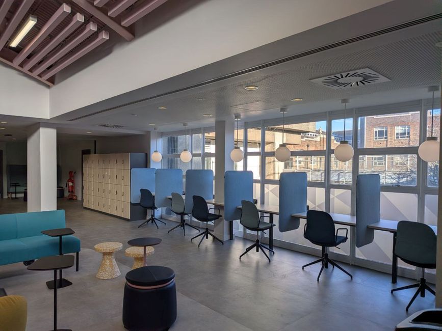
Designing for Every Mind: The Neuroinclusive Office Trades One Room for a Spectrum of Sensory Zones
Roughly one in five workers is neurodivergent, and the uniform open plan quietly taxes them all. Neuroinclusive design answers with a calibrated spectrum of sensory zones — and a business case that benefits everyone.